


TELUS Bundle Builder
Summary: The “bundle builder” is an interactive component that allows TELUS customers to easily customize and see what options were available for special deals. Check it out here
Responsibilities & Design Deliverables: Research, Wireframes, Hi-Fidelity Mockups, Prototype, Usability Test Guides
Duration: 4 Weeks
Company: TELUS, Shipped Early 2020
Overview & Problem Statement
TELUS launched an all inclusive “whole home” plan which included Internet, TV & Home Security. However, sales were not meeting expectation. The hypothesis for the underperformance was that customer’s felt “boxed in” because we were only marketing one variation of the plan, when in reality, customers had the option to upgrade/downgrade different parts of the plan to their liking (ie. Faster Internet, less TV channels etc.). I needed to design a solution that would allow customers to easily understand that there were more options, encouraging more call-ins/call backs to purchase this plan.
Competitive Analysis & Sketching
I started my design process by conducting some competitive analysis of other “plan builders” in telecom space. I wanted to explore interactions, information hierarchy and overall look and feel. I then documented my findings and got to sketching.


Design Iterations
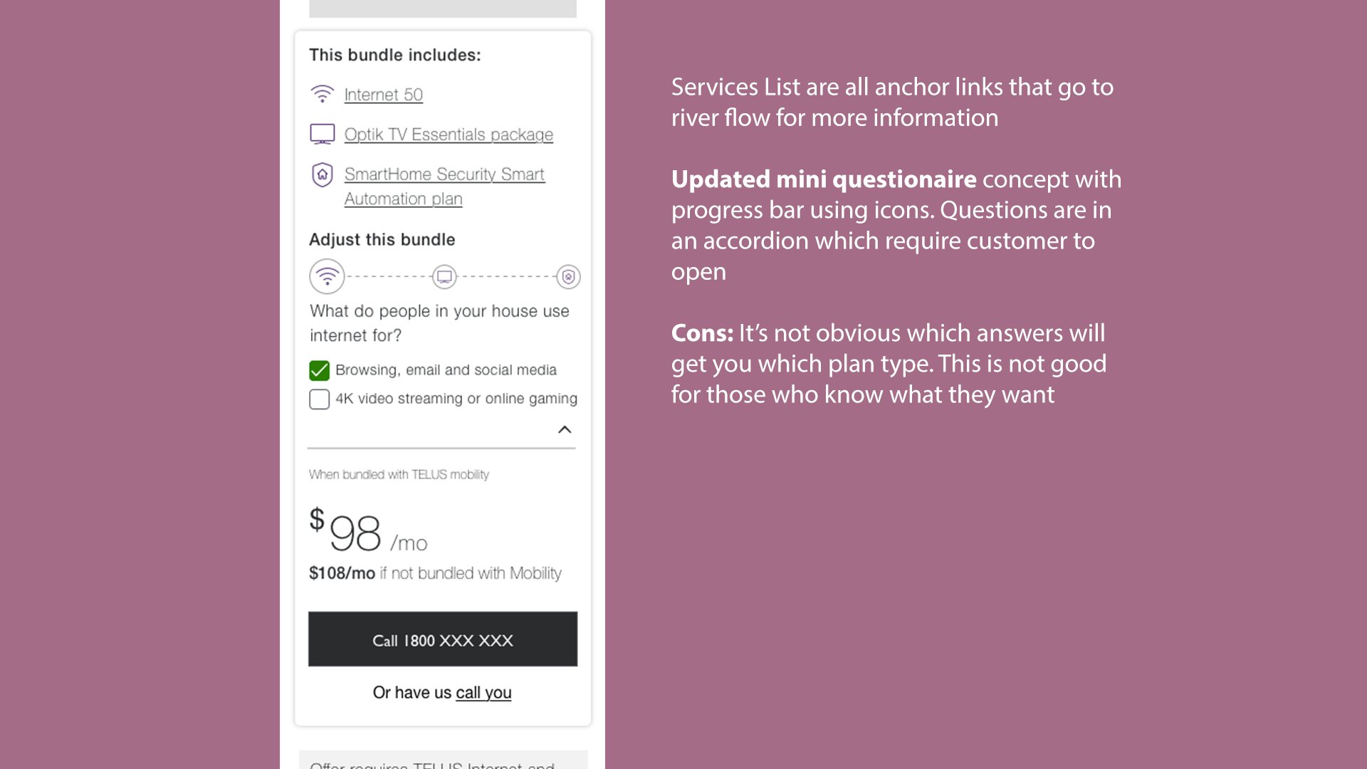
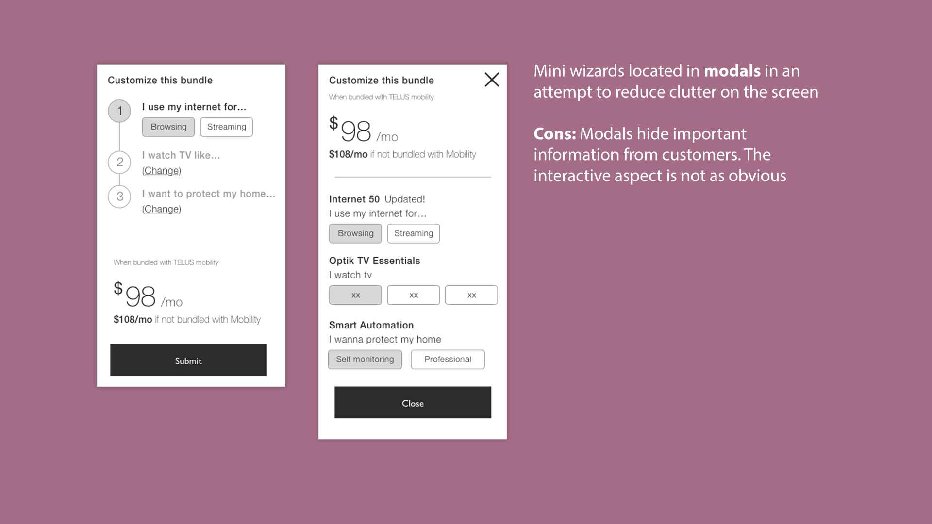
From my sketches, I created my wireframes. I made several iterations using different concepts and interaction models. My design rationale addressed the different behavioural segments (see next section) that we use at TELUS.
Throughout the process, I gathered feedback from my product team & through design critiques with the rest of the design team.


Designing with behavioural segments
At TELUS, we have been utilizing “behavioural segments” as a framework for how we approach designs. The idea is that any individual is made up of multiple behavioural segments. We can use these to look at the same problem with different lenses, resulting in a fuller spectrum of potential solutions. A design that addresses all the behavioural segments is more likely to work for a variety of people. In this case, all the listed behaviours below are based on people who are looking for TV and Internet packages. These behavioural segments were created through extensive UX research (diary studies, in depth interviews, etc.)
Final iteration before Usability Testing
“Direct & Minimal” Purchasing is just another task, time is more important than money.
How this is addressed: Because the cards are ordered from lowest price to highest (least to most features), its easy for these folks to scan and select their plan quickly.
“Fresh & Confident” Familiar with cell phone plans, but new to ISPs. They’re confident learners but lack experience.
How this is addressed: Like the direct and minimal, these customers can select what they want if they know what they want. They also have the option to play around if something else catches their eye. CTA gives clear expectations for next steps.
“Thoughtful Analysts” Sensible shoppers with a strict criteria and opportunistic tendencies.
How this is addressed: These customers can tinker around to fit their needs and use the dynamic pricing and indicator of savings to make their decision.
“Anxious and skeptical”
Stung before, they distrust corporate culture and seek reassurances they’re making the right move.
How this is addressed: This component gives these customers a chance to play around without committing. Additionally we will add information on the page regarding a 30 day guarantee to help ease the worry of these customers.
“Hand Holders”
Easily frustrated, they have specific questions about each step of the process.
How this is addressed: Instructions are laid out and arrow icons indicate interaction. Each card also contains some information. Additionally, the CTA gives them reassurance that they will have a chance to ask questions over the phone with an agent.

Usability Testing
I validated the design rationale through unmoderated usability testing with 6 different participants. The key objectives were to understand if the intended interaction was intuitive and if users could comprehend what was included in the bundle, the cost, and if the information provided was sufficient enough for them to move onto the next step. I framed the study using the following hypotheses:
Customers are more inclined to call in (or set up a call) to talk about this bundle if they see that they can customize it.
Pricing is a big motivator for customers and thus will adjust their plan accordingly.
Customers are interested in learning about the plans in more detail.
Demo of the prototype
Testing Insights
Most/All participants:
Attempt to use the swipe gesture to move the bundle builder card.
Find the call out to total savings very attractive
Understood the intended progression of services from lowest to highest, or least features to most features.
About half of participants:
Like that they are able to customize the bundle to their needs. However, several people mentioned that they would not need TV, Security, etc.
Few participants:
There is curiosity as to what is included in a theme pack. Some participants inquired about channel selection.
One participant mistakened the bundle to also include mobility service.
Overall findings:
All participants understood the intended purpose of the bundle builder. The interaction is intuitive, however, everyone expected to be able to swipe left or right. Overall, participants felt comfortable with the amount of information and would proceed to the next step if they were shopping for this plan.
Visual design iterations
Fortunately there were no major changes to the design based on the usability tests. My focus now was to continue fitting the design into the TELUS standards, get feedback, discuss development effort and create desktop and tablet variations of the design. I played around with different (plan) card sizes and arrangement of the key elements.

Final Visual Design
The directional arrow UI was updated to be more prominent (and larger hit box) and a grey backing was added to make the plan cards pop off the screen and to contain the overall bundle builder component. The swipe functionality was also implemented for the mobile version.
The rest of the page is composed of existing TELUS design system elements & components with updated copy and images.
Live demo
A/B Testing & Results
We ran a 2 week A/B test on the campaign page, using the existing design (without the bundle builder) and with the new version (bundle builder and page layout changes)
Version A - Existing design
(Call back form) Submission rate
0.56%
Version B - New design
(Call back form) submission rate
1.01%
Next steps…
This component had proven to be a big success and is currently being updated to include additional services and used across other parts of the website.