
introduction
〰️
introduction 〰️
Leading the way for big gains on the core conversion surface at Chegg

How I went from this…
…to this!
Chegg is a popular SaaS-based provider of homework help & exam prep for US college students.
How do you even get to this page?
From Google search, you land on a content page
Authenticate
Background:
The plans interstitial page is the primary conversion step in Chegg’s lower funnel. Due to it’s financial impacts, this surface had been optimized through heavy experimentation, leading to stagnating growth from conservative changes.
I created a new vision for this surface, leading the charge on a variety of design changes that lead to:
7% Increase in CVR ($10M/YoY)
My Role
Lead Product Designer
Cross-functional Partners
Business-operations, Product Marketing Management, Engineering, Creative Marketing
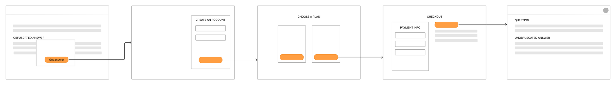
Select plan - WE ARE HERE
Checkout
Signed-in content page
Timeline
2.5 Months
Problem to be solved
This project began as a last-ditch initiative to gauge the viability of a multi-month plan (versus monthly), with a hefty goal of increasing CVR conversion rate by at least 2% on the plans interstitial page - the main point of conversion for Chegg customers.
Given that this surface was tied directly to revenue, it was safe guarded through experimentation and became highly optimized. In other words, small changes like adding icons or fixing copy had little effect. We hypothesized that to have any chance of significantly improving our metric, we would have to take a bold approach - with no definition of what this meant for us.
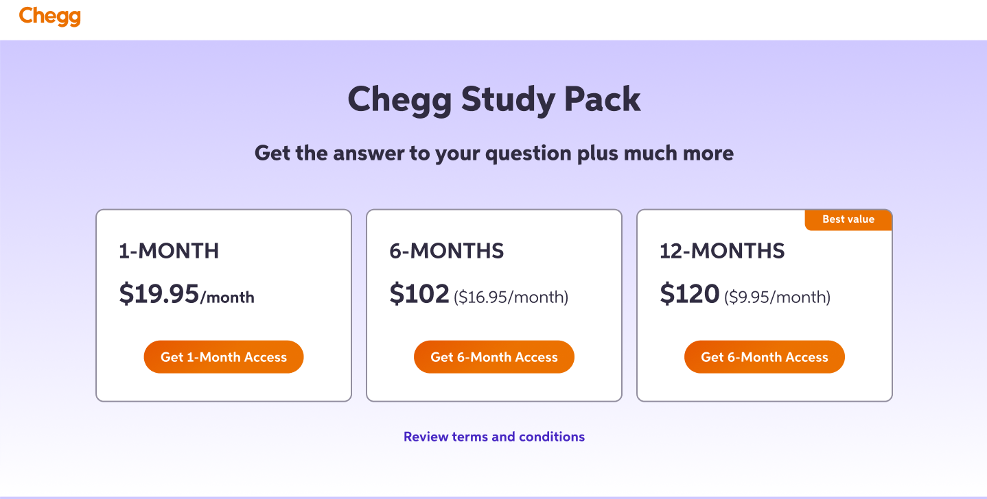
My previous design iteration for multi-month plans, using the “status quo” look & feel. Minimal CVR gains.


design process
〰️
design process 〰️
Supporting Research & Data
Foundational
Chegg’s primary customer base are college students, who are generally more cost-adverse. Students tend to be more careful in their purchasing habits, holding higher standards toward personal gained value versus cost. To assess quality, students also gravitate towards products or experiences that are highly rated by their peers.
While Chegg offered a variety of learning tools and supported more than STEM subjects, we had found that many students were not aware of this offering. When given a more thorough explanation of Chegg’s value in interviews, students became excited and understood the prospect of how this would fit within their own study goals. Additionally, Gen-Z was becoming the most prominent customer base.
Focusing on the needs of Gen-Z is crucial for Chegg’s success, as the demographic of Millenial students is dropping sharply.

Gauging the competitive landscape
With the short timeframe and lack of resources that I had, I decided to conduct a competitive analysis on primary and secondary competitors to fill in some of the gaps for understanding what may resonate more with Gen-Z from a look and feel perspective. I noticed the prominent usage of darker, high contrast visuals, larger headers with impactful statements and a more casual tone of voice.
Defining the “bold approach” from a design perspective
Based on the research, I identified 3 hypotheses that I wanted to create solutions for and test.
Hypothesis #1
The current look and feel does not resonate with Gen-Z customers
Hypothesis #2
The current experience lacks a voice that resonates with Gen-Z customers
Hypothesis #3
The current experience lacks the information customers need to feel good about subscribing
Design Exploration
Solving for hypothesis #1
Theme: High contrast, high impact visual aesthetic
I used a dark base color for the top of the fold to create a higher contrast, using one of the darkest colors in the design system

I added a larger header, to play around with more eye-catching copy

Solving for hypothesis #2
Theme: Speaking the language
I played around with a playful, and more conversational Gen-Z coded tone of voice.

Solving for hypothesis #3
Theme: Building more trust and understanding for the product
Adding social proof to create more credibility and sense of “FOMO”

Highlighting breadth of subjects covered

I wanted to incorporate more “short form”-like content, as a high percentage of Gen-Z students enjoy platforms like TikTok.

Focus on outcomes versus talking about features

Adding more details to the content, so that students understand what they’re getting with a subscription

Design exploration in context
Adapting to sudden change
Midway through this project, the business decided to give up on multi-month plans, as the economics were not making sense. This put a stand still on work momentarily. However, some of the first design changes were already slated for experimentation.
Influencing cross-functional teams
I focused heavily on orchestrating all of the moving parts to build toward this design-driven vision, proactively setting up discussions and following up with different people to walk through ideas and refine them as a cohesive unit. I found that this was helpful in getting my partners to understand the rationale, while also contributing their feedback.
Working with Creative Marketing
I worked closely with this team to inject the brand identity in our updated visuals. One of my challenges was to sell this team on the usage of darker colors, as this directly opposed the light and airy nature of the Chegg brand at this point in time. This team explored elements like gradients, illustrations & animated assets, where I focused on tying this in with our design system components and negotiating with stakeholders on what elements needed to be in this experience and how they would all function together.
A sample of brand exploration from Creative Marketing


Launching experiment #1
For this experiment, we had multiple variants consisting of these 3 elements: updated header, dark color & social proof component. In this test, we found that the winning variant consisted of all 3 elements, versus in isolation. The winning variant also exceeded the original metric set forth by the business at the beginning of this project, creating a wave of excitement and reigniting the continuation of this design vision and further experiments. These initial results also served as the data needed to convince my partners in Creative Marketing to reconsider Chegg’s visual identity.
Multivariate test
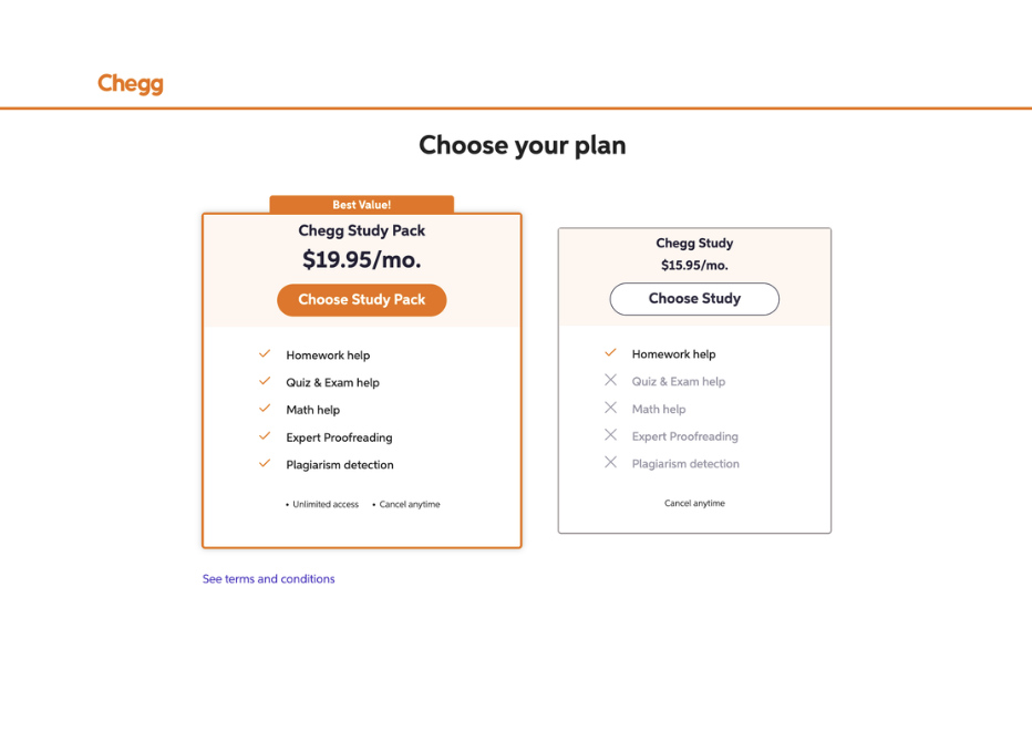
Control
Winning variant
+4.16% CVR
Refining the visual design
With the success of the first experiment, I continued working on refining the overall page structure and components. I worked with a content designer to refine the copy, and continued working with Creative Marketing to produce animations and brand visuals.

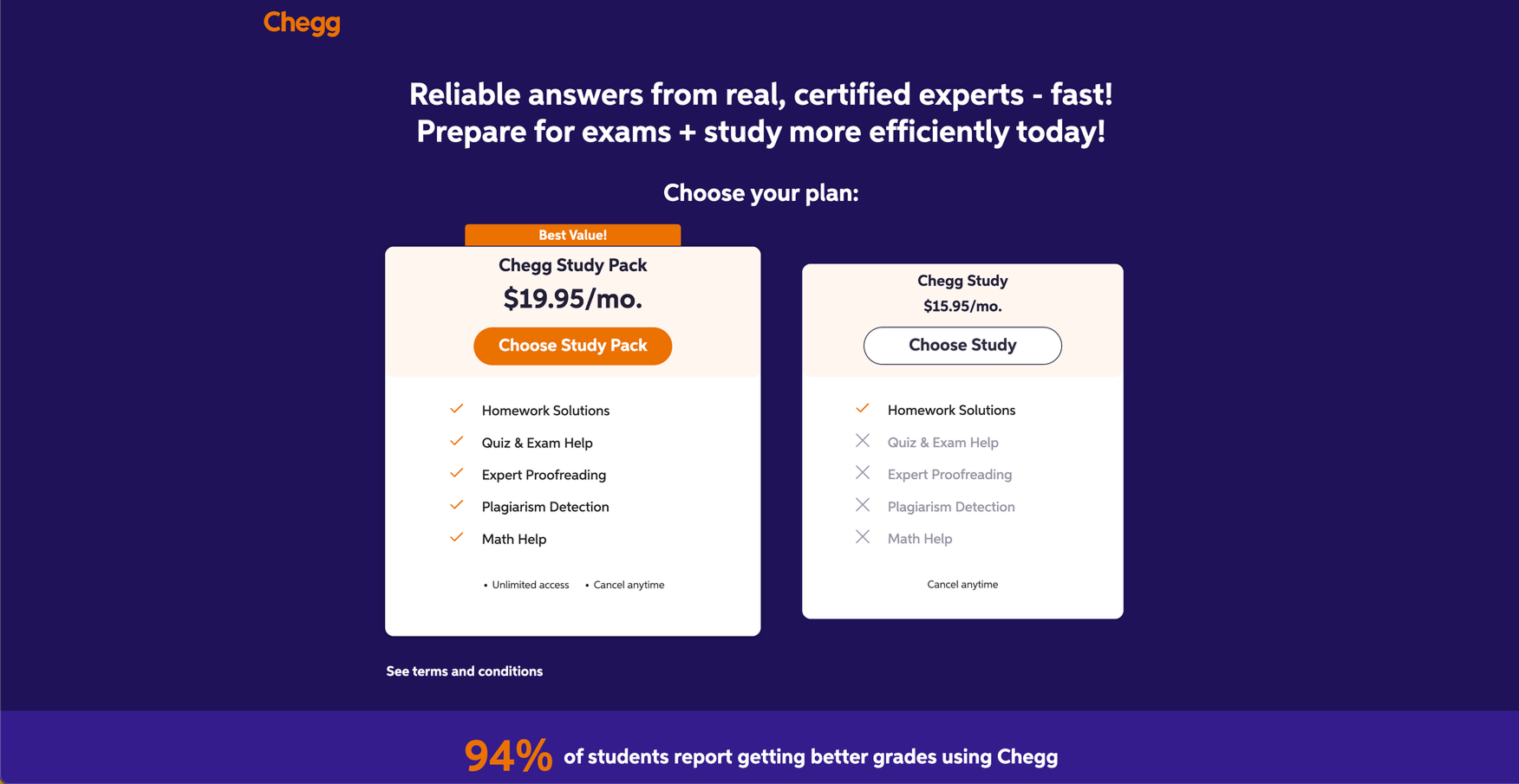
Control

Winning variant
+3.08% CVR
Launching experiment #2
A/B test
For this experiment, we incorporated an updated version of the original 3 elements, utilizing the refined visual design for our background color and social proof component. This saw an even further increase to conversion rate, and really solidified that our customers really resonated with this new look and feel. This caused an uproar of excitement throughout the company, as this amount of increase to CVR was the most we had seen on this surface, in years. My colleagues were calling for everything to be turned purple!
outcomes
〰️
outcomes 〰️
Finalizing the design
With the success of the first set of experiments, I continued to tinker with the “final” vision of this design with my working team and cross-functional partners. We produced new animations and solidified the sections of this page, with the plan to continue experimenting on the additional components below the fold.
Impact
To recap, our experiments resulted in:
7% increase in CVR, a value of $8~10M/YoY.
These results had a significant impact, as we had not seen these types of numbers in years. This brought a lot of excitement throughout the business. Other teams were interested in integrating our findings into their own work and leaning more into design-led strategies. Notably, the official Chegg brand, and general visual design language at the company started evolving itself toward this bolder, high contrast palette that you will still see on the platform today.
Moving forward, the team is continuing experimentation on this surface, adding in the additional animations and content below the fold.
My takeaways
If you believe in your hypothesis, find a way to launch the experiment.
Data can be leverage to negotiate with stakeholders to build confidence toward a certain vision.
When we get to a point of stagnant growth, we can explore ways to create a new baseline. Oftentimes this means we’re doing something that’s not meeting the needs of our human customers.