
introduction
〰️
introduction 〰️
Reimagining and scaling the lower funnel experience at Chegg
Chegg is a popular SaaS-based provider of homework help & exam prep for US college students.
Equal parts redesign & net-new design exploration, this project revolves around building a flexible lower funnel experience, resulting in:
1.4%+ account creation
2%+ CVR (~4.5M annualized incremental revenue lift)
My role
Lead Product Designer
Primary Metric
Conversion
Timeline
2 Months
Problem to be solved
In the wake of AI, Chegg begins building towards a new “chat-like” core experience, moving away from hosting it’s content on individual webpages and centralizing all features & functionality into one interface.
This included the need to reimagine the lower funnel experience, which redirected students away from their original entry point, causing a loss of context in the user journey. This solution needed to be flexible, while incorporating the successful learnings of other design experiments in the lower funnel.
design process
〰️
design process 〰️
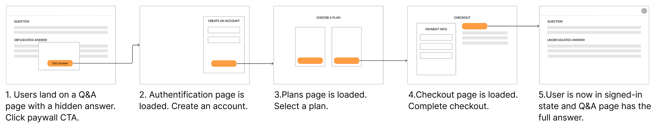
Understanding the existing flow
In the legacy experience, customers would arrive to a Chegg content page via Google search for a question they are trying to solve. They are presented with a paywall, and go through several steps to get to the answer that they seek, losing context as they get further away from their entry point.
New flow exploration
In this new flow, I explore this concept of a “contained” conversion funnel, incorporating all of the steps into a modal experience.
Designing a proof of concept
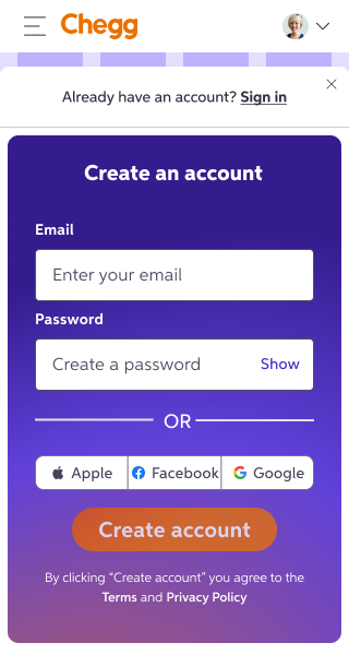
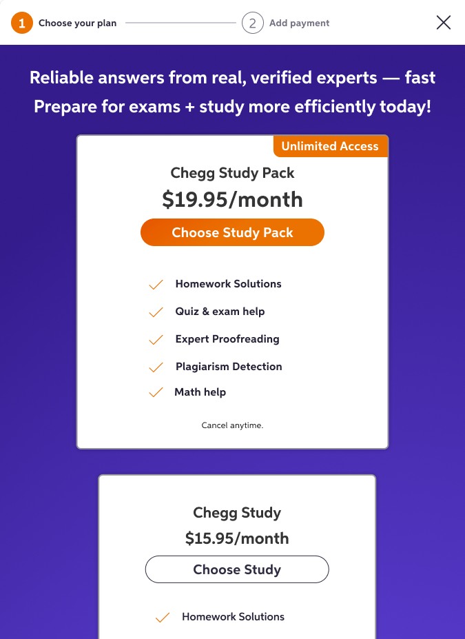
To build and test quickly, I collaborated with engineering to determine the path of least resistance. From a technical perspective, utilizing our existing modal component was the first step towards an MVP. I reconfigured the atomic components from authentication, plan selection and checkout to fit within these confides.
I determined with my PM that building a “progress bar” component would also benefit by acting as a means of navigation within the experience, as well as nudging users forward in the funnel.
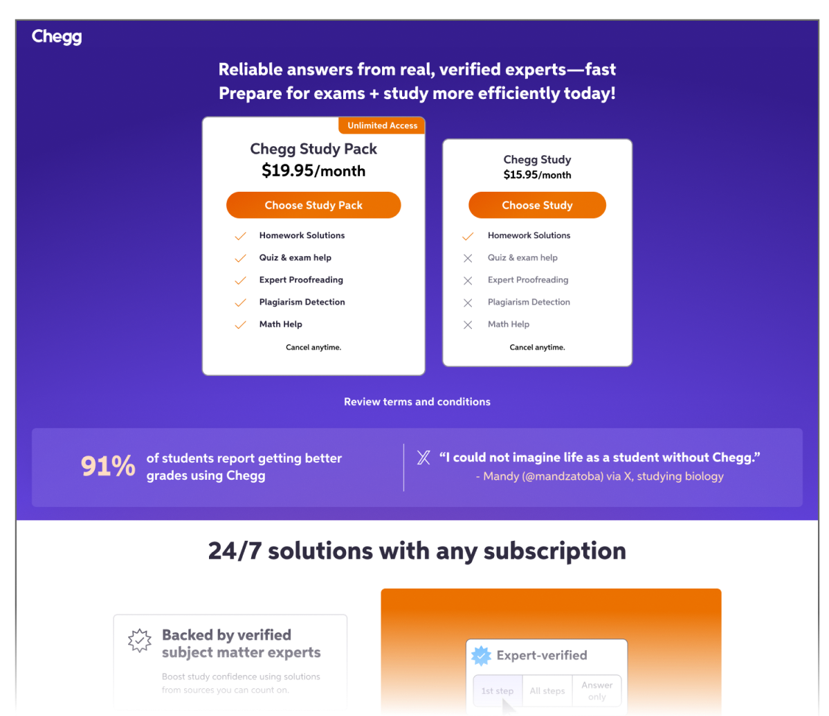
In our initial testing, we found that there was actually a drop in CVR. However, we saw an increase in account creation. Given that this design iteration had not yet leveraged the latest visual design and learnings seen elsewhere in the funnel, it made sense for us to continue iterating and experimenting.
Initial A/B Test
Exploring a new design pattern
With the breadth of content and functionality we wanted to incorporate into the lower funnel, I found that the modal was too restrictive. I explored a new design pattern that could better fit these needs, while still being flexible.
Given that the new Chegg experience utilized a left-hand navigation, I designed a slide-in, “drawer” container on the right side for larger view ports.
Like with modals, this would better keep the user in context, but also provide much more usable vertical real estate within the component.
I took a mobile-first approach to iterating on this design, weaving in the updated Chegg visual language which proved to be successful in other experiments.
I wanted to incorporate these elements with functionality and aesthetics in mind, such as utilizing the dark purple to anchor the header & progress bar, and using the heavy stroke and drop shadow to highlight CTAs.
To tie everything together at the end of this flow, I incorporated the signature Chegg orange to create a fullscreen “success state”, adding some delight to this funnel.
Iterating on visual design
Continued iterations…
I shared my work with the larger design squad, rationalizing concepts and pushing the boundaries of improvement. This gave me further opportunities to try other stylistic choices and interaction patterns, such as using some softer colors from the design system palette, and reserving the boldest colors for CTAs.
In this exploration, I also experimented with having both plan selection & checkout in one step. (It may take a moment for the prototype to load)
(I’m scrollable!)

Combining learnings from other experiments & moving forward
My iterations moved farther away from what was proven to be a successful design treatment with the plans page, a redesign that I had led.
With new plan promotions slated in the roadmap, I took a step back and focused on reconfiguring this layout to fit into the confides of the new drawer component.
Ultimately, I decided to only utilized the “purple design” treatment for the plans step, and kept the authentication and checkout step as-is, due to timing.
Redesigned plans page
Usability Testing
Before moving into development, I ran an unmoderated usability test with 10 participants to learn the following:
Did students have an easy time searching for a homework question and subscribing to Chegg in this new experience?
Does the sizing of the drawer component pose any issues.
Given that the maximum size of this component was close to the tablet breakpoint, did students preferred a side-by-side plan card layout, or a stacked layout for ease of selecting and comparing plans?
I prepared two versions of the prototype and ran the test with two separate cohorts, each seeing either version A or B on their first run through. This was purposely done to mitigate any preferential bias for the first design they saw.

Versions A & B
Test prototype
Highlights
Most participants preferred the side by side design, noting that it was easier to compare plans. In terms of usability, some friction appeared when the participant had a shortened browser window, indicating that the designs could benefit from a more obvious vertical scrolling bar.
outcomes
〰️
outcomes 〰️
As we continued development, we ran additional A/B tests, which had positive results. In comparison to the original lower funnel flow on the webpages, we saw:
Overall impact
2% Increase in CVR
$4.5M annualized incremental revenue lift
Demo
Both the drawer container component and progression bar/nav were added to the design system. Both components had flexible use cases and would be utilized on other surfaces at Chegg.